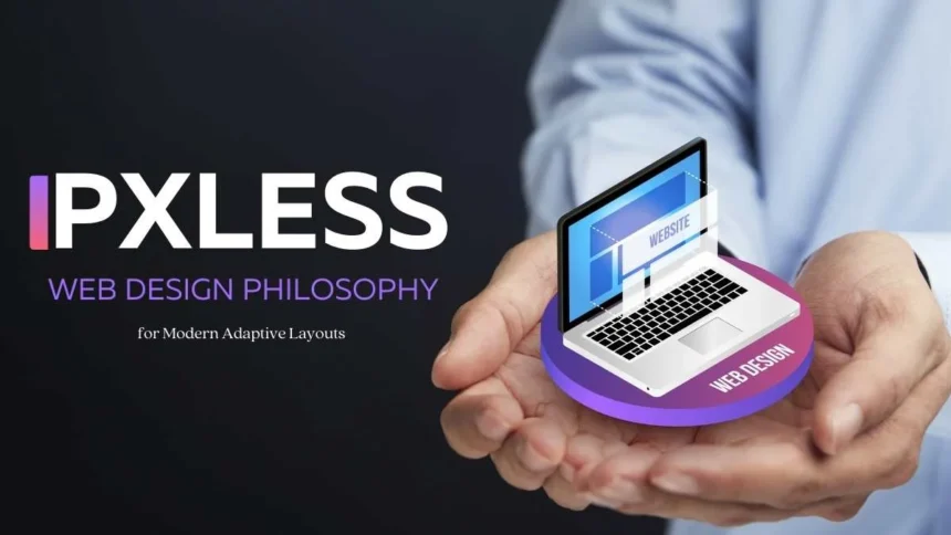
Pxless is a modern web design philosophy that focuses on building fluid, responsive, and adaptive layouts without relying heavily on fixed pixel values. It answers the growing need for websites that look and function consistently across smartphones, tablets, laptops, ultra-wide monitors, and even future display formats.
- Why Pixel-Perfect Approaches Fall Short
- The Pxless Approach in Simple Terms
- Core Units That Power Pxless
- Key Benefits of Pxless Philosophy
- Pxless vs Pixel-Perfect: Comparison
- Practical Implementation Tips
- Where Pxless Is Already Making Impact
- Real-World Applications of Pxless
- Why This Philosophy Matters for the Future
- FAQs
- Conclusion
What makes Pxless web design different is its emphasis on relative units: percentages, em, rem, and viewport-based measurements like vw and vh. Instead of static, pixel-perfect alignment, this approach ensures typography, spacing, and layouts scale proportionally with the user’s device and preferences. The result is a flexible, accessible, and future-proof web experience that adapts naturally while saving time and costs for developers.
Why Pixel-Perfect Approaches Fall Short
For years, designers strived for pixel-perfect design, where every element aligned precisely to static pixel values. While once considered the gold standard, this rigid method often struggled to adapt to diverse screen sizes, broke accessibility when users zoomed or scaled text, demanded the creation of multiple breakpoints to stay responsive, and significantly increased both development time and long-term maintenance costs. In today’s world of ever-growing device diversity, this static approach simply cannot keep up.
The Pxless Approach in Simple Terms
Instead of chasing exact pixel alignment, Pxless design philosophy emphasizes:
- Fluid Layouts: Elements adapt proportionally to any screen width.
- Responsive Typography: Fonts scale using rem, em, or clamp functions.
- Flexible Spacing: Margins and paddings respond to relative sizes.
- Universal Adaptability: Works seamlessly on mobile to high-resolution desktop.
- Inclusive Accessibility: Supports Zoom, larger fonts, and assistive technologies.
This doesn’t mean sacrificing aesthetics. It means prioritizing visual rhythm, proportion, and usability over rigid measurements.
Core Units That Power Pxless
The Pxless approach relies on a toolkit of relative units that adjust dynamically based on screen size, user preferences, or parent elements:
- Percentages (%): Ideal for widths and container sizes, allowing layouts to adapt fluidly.
- emL: Relative to the font size of the parent element, often used for spacing and typography scaling.
- rem: Relative to the root element (html) font size, providing consistency across an entire design.
- vw & vh: Viewport width and height units, excellent for creating layouts that adapt directly to screen dimensions.
- min() / max() / clamp() – Modern CSS functions that define responsive ranges for font sizes and spacing.
Key Benefits of Pxless Philosophy
Shifting away from rigid values delivers measurable advantages:
1. Works Across All Devices
From small mobile screens to ultra-wide desktops, layouts remain intact.
2. Boosts Accessibility
Accommodates user scaling, large fonts, and visual assistive tools.
3. Saves Development Time
Reduces dependency on endless breakpoints and manual adjustments.
4. Future-Proof Designs
Layouts naturally adapt to foldables, wearables, and upcoming formats.
5. Improves User Engagement
Readable, intuitive interfaces lower bounce rates and strengthen SEO signals.
Pxless vs Pixel-Perfect: Comparison
| Feature | Pixel-Perfect Design | Pxless Design Philosophy |
| Units | Pixels (px) | %, em, rem, vw, vh |
| Responsiveness | Manual breakpoints | Fluid scaling |
| Accessibility | Limited | Inclusive by default |
| Future Compatibility | Needs redesigns | Device-agnostic |
| Development Time | Higher | Faster, efficient |
| Design Focus | Exact alignment | Proportional rhythm |
Practical Implementation Tips
Applying it effectively requires a mix of strategy and coding techniques:
1. Build a Flexible Grid: Use CSS Grid or Flexbox with % and fr units for smooth layouts.
2. Scale Typography Smartly: Adopt rem and clamp() for text that adjusts without breaking layout.
3. Rethink Spacing: Replace static pixel paddings with em or % for natural scaling.
4. Harness Viewport Units: Ideal for hero banners and full-screen sections with vh and vw.
5. Test Across Devices: Check proportions on mobiles, tablets, laptops, and widescreens early.
Where Pxless Is Already Making Impact
Many global brands and frameworks are already applying Pxless-inspired strategies in their design systems. Google’s Material Design emphasizes proportional layouts, Airbnb and Apple have prioritized accessibility-first scaling, and modern frameworks such as Tailwind CSS and Bootstrap 5 encourage developers to work with fluid units by default. This widespread adoption proves that Pxless is not a niche experiment but an industry-driven trend shaping the next generation of websites.
Real-World Applications of Pxless
Many modern design systems and frameworks have already embraced its principles:
- Tailwind CSS allows responsive designs using scalable units and flexible utilities.
- Google’s Material Design emphasizes proportional layouts that scale across devices.
- Bootstrap 5 integrates fluid grids and scalable typography as defaults.
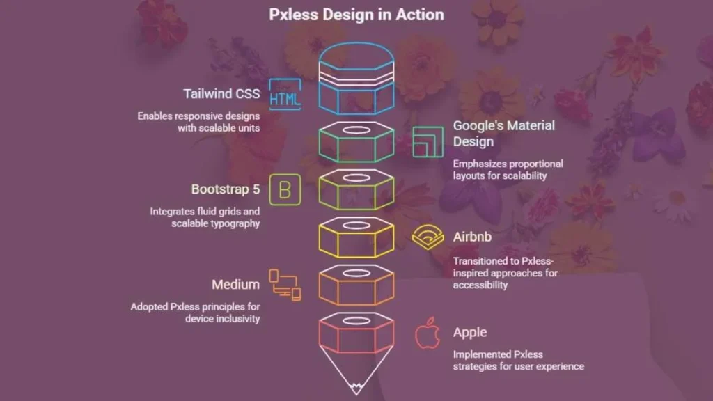
Beyond frameworks, major platforms like Airbnb, Medium, and Apple have transitioned toward Pxless-inspired approaches to ensure accessibility and device inclusivity.
Why This Philosophy Matters for the Future
The digital ecosystem is evolving rapidly with foldable devices, ultra-wide screens, and accessibility demands reshaping online experiences. Pxless meets these needs by focusing on flexibility, inclusivity, and efficiency, ensuring websites remain durable and user-friendly across all devices. Unlike rigid pixel-perfect methods, which risk becoming obsolete, Pxless future-proofs design with adaptability at its core.
FAQs
Q1: Does Pxless mean giving up precise design control?
No, it means controlling proportions instead of static pixel alignment.
Q2: Is Pxless suitable for e-commerce websites?
Yes, it improves product display consistency across devices.
Q3: How does Pxless help SEO rankings?
Better UX reduces bounce rates, boosting SEO performance.
Conclusion
Pxless design philosophy is more than a technical trend; it’s a user-first mindset. By emphasizing fluid layouts, scalable typography, and proportional spacing, it enables websites that remain accessible, consistent, and durable in an ever-expanding device ecosystem.
Instead of obsessing over pixel alignment, it embraces balance and adaptability. For businesses, developers, and users alike, this shift is not optional; it is the future of sustainable web design.